USA GDP and GNI per capita adjusted for inflation 1960 - 2014
May 31, 2016
Has the overall economic situation for people living in the United States of America improved since 1960? Or is the economic situation the same now as it was in 1960? You can’t spend too much time thinking about these situations without considering the scary alternative. Are people living in the USA now worse off than they were in the 1960s?
This is a very complicated topic to demonstrate effectively. One could look at employment rates, literacy rate, life expectancy; it’ll just get out of hand. I want to know what the overall economic trend is for those living in the USA. Specifically I want to know if the value of someone participating in the USA economy is higher now than 50 years ago. I believe that looking at this trend may be useful in understanding how the current economic situation relates to the past. Overall it is desirable that the value per person in a country increases over time, as this could lead to improved economic quality of life.
Gross Domestic Product (GDP) has been useful metric for comparing the economies of different countries. It’s especially useful for understanding the relative scale of different economies. GDP represents the total gross value added by residents of a particular market. The GDP of the USA looks only at the economic contributions within the USA. Contributors to GDP include people, technology, natural resources, and intellectual property. Another useful metric is Gross National Income (GNI). From what I understand, the difference between GDP and GNI is that GDP is specific to a particular geographical situation, while GNI data looks at the economic ownership. If a USA resident owned a business in India, the value of goods produced from that business would count for GNI and not GDP.
I obtained the GDP and GNI (Atlas method) information from The World Bank of the USA between 1960 and 2014. I then plotted the data using Python; you can see the plot below.
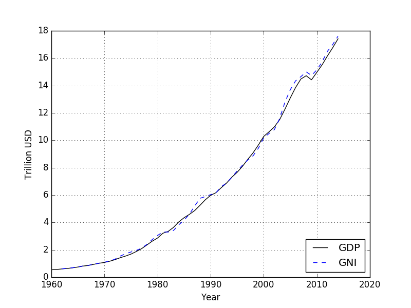
Well we can clearly see that the GDP and GNI are increasing exponentially. This is largely due to inflation. Additionally just looking at the GDP and GNI levels isn’t a good enough sign of improvement. One of the largest contributors to GDP is the number of people participating in the economy. Naturally when the population increases there will be additional consumption and production from the extra people. We know the population of the USA is vastly different in 2014, than what it was in 1960. So what we actually want to use is a per capita metric to compare economic situations.
GDP per capita and GNI per capita
This is all fine. The World Bank includes population data for the USA as well. So if we take the GDP and GNI data I have collected, and divide each by the population of the year, we end up with GDP per capita and GNI per capita. The GDP per capita effectively demonstrates the value of each resident of an economy. Together these metrics can be related to the average gross income of residents in a country.
An improving economic situation for the average residents of a country would show that the per capita values of both GDP and GNI are increasing over time. We want to see that the GDP per capita and GNI per capita of the USA are increasing; because it represents that the value of the people is increasing over time. Potentially compensation and lifestyle increases follow this increase of value. I’ve taken the GDP and GNI data and divided it by the population for each year. The result is the following plot of the per capita GDP and GNI of the USA.
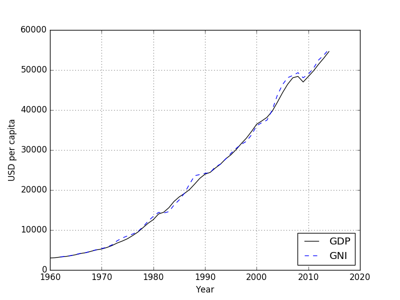
The plot of the per capita GDP and GNI has the same exponential trend as the plot of just the GDP and GNI. We know that the US Dollar (USD or $) has inflated in value since 1960. In order to understand if GDP per capita is increasing, we’ll need to adjust for inflation.
Dealing with inflation
The Bureau of Labor Statistics has been monitoring the effects of inflation with the Consumer Price Index (CPI). Now the CPI isn’t actually an inflation index, as it’s a bit difficult to monitor actual inflation rate. The CPI is effectively a price of goods index, which helps compare purchasing power at different times. So we can use the CPI to relate the purchasing power of $ in 1960, and other years, to the purchasing power of $ in 2014.
I adjusted the GDP per capita and GNI per capita plot for inflation with the CPI values, such that all prices are in 2014 US dollars. The plot can be seen below.
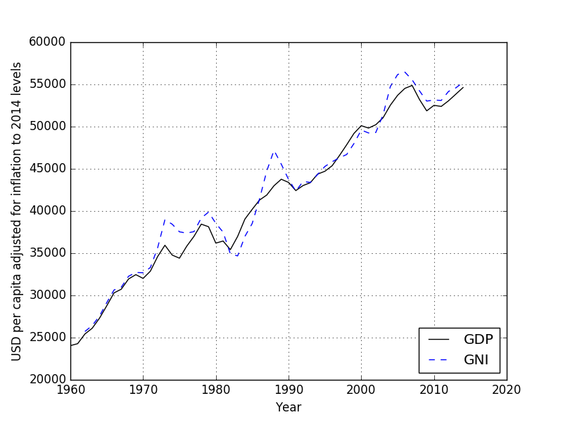
When we look at the GDP and GNI per capita values adjusted for inflation, we see that overall both GDP per capita and GNI per capita in the USA have been increasing steadily from 1960 through 2014. This is overall a good sign, and it doesn’t appear that the values have hit either a plateau or peak yet.
What happens if the CPI is wrong?
It is important to mention that the CPI isn’t a magic inflation calculator. The methods for determining CPI have often been criticized. Some believe CPI overestimates inflation, while others believe CPI underestimates inflation. I am a bit curious to see how an overestimating/underestimating CPI value has on the adjusted GDP per capita.
So let’s assume a very minute underestimation and overestimation case, where the Bureau of Labor Statistics has been consistently over estimating or underestimating the actual CPI value by just 0.5%. To continually overestimate or understate by a constant margin will represent the worst possible case. What I believe has most likely occurred is that the CPI value has sometimes been an overestimated value of inflation, and other times been an underestimated value of inflation. I made a plot just showing the adjusted GDP per capita (since GNI per capita was so similar) for inflation assuming the two potential cases: 1. The CPI has overestimated inflation by 0.5% each year. 2. The CPI has underestimated inflation by 0.5% each year. You can see the plot below.
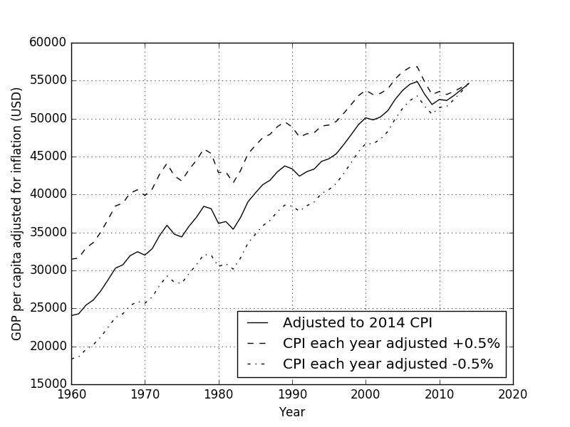
Now if the CPI has underestimated inflation that would mean the real inflation value has been higher than the CPI value. The opposite is true if the CPI has overestimated inflation that would mean that the real inflation level would be lower than the CPI value. What we see in the plot is that if the CPI value has been underestimating inflation by 0.5% each year ends up being significant over time. We would be looking at a GDP per capita in 1960 of $32,000 vs. $24,000. Though the same can be said if the CPI has been overestimating inflation by just 0.5% a year, we see a significantly steeper increase in GDP per capita over the years.
Overall 0.5% in one direction or the other sounds small, but what would the GDP per capita look like if the error in our inflation measure were even larger? I made a plot below assuming that the CPI value has been over and under estimated by 1.0% since 1960.
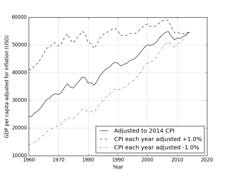
It’s getting interesting. If CPI values have been underestimating inflation by just 1.0% each year, meaning the real inflation rate was 1.0% more than the CPI value each year, the GDP per capita would look stagnant. In fact the GDP per capita would appear to have stopped growing in the early 1970s. It’s a scary thought to see that potentially the value per person hasn’t been changing in the past 40 years. On the other hand if CPI has overestimated inflation by 1.0% each year, then the USA GDP per capita growth between 1960 and 2014 looks stellar.
So what would happen if we increase the error in the CPI value to let’s say 2.0% each year.
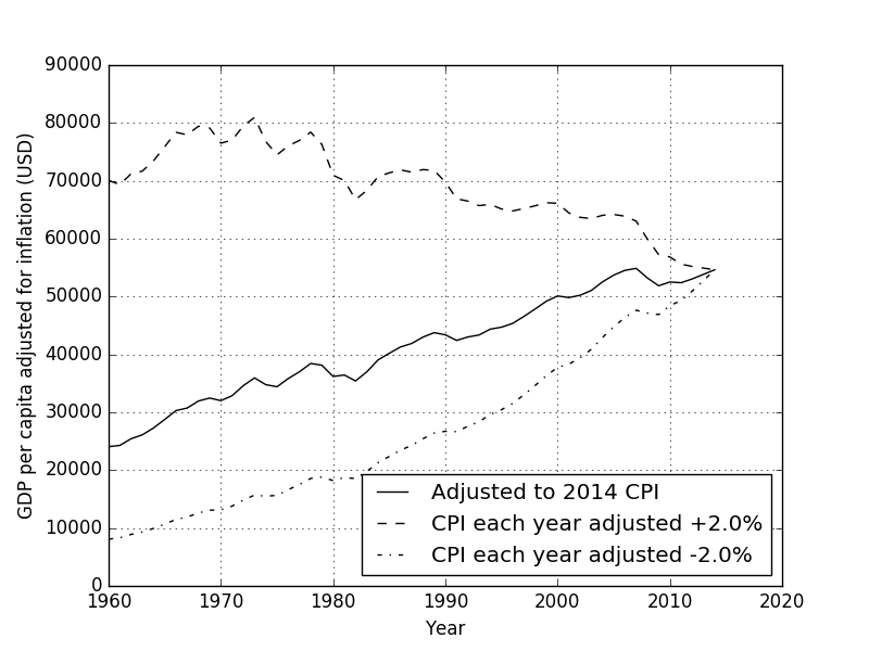
If the CPI has been underestimating inflation by just 2.0% each year, the scary situation where GDP per capita is actually decreasing overtimes begins to appear. Again it’s important to state that these represent worst-case scenarios where the CPI is consistently either over or under estimating the real inflation rate. What is likely the case is that sometimes the CPI is an overestimation of the inflation, and other times the CPI is an underestimation of inflation. Overall I would expect the real GDP per capita of the USA to be somewhere between the lower and upper lines in the plots shown.
Concluding thoughts
GDP per capita and GNI per capita were calculated for the USA between 1960 and 2014. These measures represent the economic performance per person in the USA over time. It is important to adjust the data for inflation, as the US dollar has significantly weakened over the last 50 years. For this work, the metrics were adjusted for inflation using the BLS’s historic CPI values.
The overall trend is that the GDP per capita in the USA is increasing over time. This appears to be true form 1960 - 2014. Increasing GDP per capita is a good thing, and can mean that people are producing and consuming more. Additionally this can mean to an increase in compensation, because the value at which workers produce is higher.
I was very surprised on the sensitivity of GDP per capita to inflation when adjusting the CPI inflation error. If the CPI underestimated inflation every year by just 1.0% it appears that the GDP per capita reaches a plateau in the 1970s. It starts to get scary when you assume that the CPI value has underestimated inflation by just 2.0% each year as it starts to appear that GDP per capita has peaked in the 1970s. What I’d like to find is a statistical error metric for the CPI value. I was searching the BLS’s FAQs and didn’t find any mention of the sorts. As another alternative I could plot what the GDP per capita looks like over time with different inflation indexes.
All of the code I used to process the GDP and GNI data is available on GitHub.
tl;dr
An accurate measure of inflation is important when comparing the GDP per capita and GNI per capita overtime. Slight errors in the CPI values overtime have a serious effect on the long-term gdp per capita and gni per capita trends.